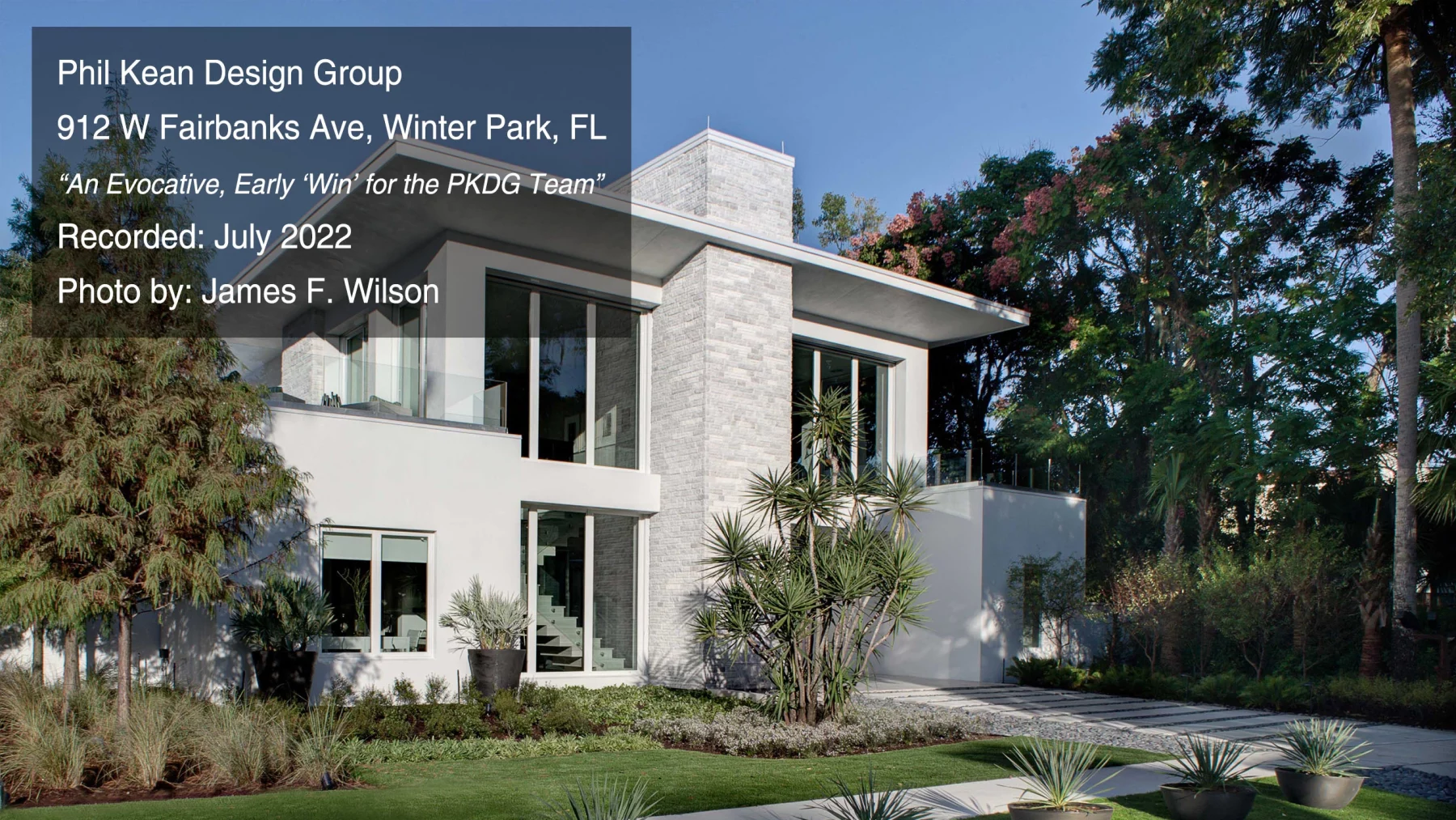
In this conversation with Phil Kean, we learn how early admiration and recognition of the architecture of The 2012 New American Home led to local and national acclaim for Phil and his firm in the modern architecture space. A continued commitment to green practices, beautiful sight lines, and a sense of daring to take bold approaches to home design are a few themes you’ll hear covered in this podcast.
Let’s face it, getting a start in the world of modern architecture is no small feat. As is the case for many decorated home designers, builders, architects, and visionaries, this was also true for the award-winning Phil Kean Design Group.
You can listen to the recorded interview via this YouTube link or read the transcript below.
Jon:
Today we’re interviewing Phil Kean. Phil Kean Design Group is a nationally awarded design and build architecture firm named “Best of Orlando” #1 Home Builder by Orlando Magazine, voted Best Home Builder – “Best of Winter Park” three years in a row by Winter Park, Florida Chamber of Commerce, “Best of Houzz”- Design Award by Houzz.com, and winning the Platinum and Gold awards from the National Association of Home Builders’ Best in American Living Awards. Today we’re going to be talking with Phil to get a behind the scenes talk through of the award-winning New American Home 2012.
Phil Kean with Phil Kean Designs is with us today, and he’s going to be sharing a bit about a project that I think is absolutely remarkable and you’ll be able to get a link here to see the project this interview is on. I would say, peruse it…I mean these are just amazing images of a beautiful project. But before we get into that, Phil, thank you so much for being with us this morning.
Phil:
Thanks for including me this morning.
Jon:
We’re excited, this particular project titled The New American Home in 2012, it is really beautiful. From an aesthetic standpoint, from a look and feel standpoint, from a design…the aesthetic is just gorgeous. It has also won the “Best of Show” award in 2012, which I believe is the Golden Aurora Award, congratulations on that. That is definitely bit of high praise. At this point, Phil, you tend to get awards for so many of your designs, I don’t know if it surprises you anymore! Anyway, that’s a gorgeous design. Before we get started in terms of the actual project itself, I’d love to hear a bit of the backstory on this project and maybe a bit about the layout in terms of the neighborhood potentially, and maybe even design challenges that may have been presented to the site itself. I mean, were there any details there that are worth going over?
Phil:
Sure. There are always these little odd lots, and this was a lot that had sort of been overlooked because there was a five-story condominium next door that really shared an alley with the lot, so all of the windows that faced the lot could see right into the house. So the challenge really was how do I create some privacy from the five-story building? And that was challenge number one. Another challenge was Winter Park, which is where the house is built, has a lot of very interesting code restrictions. You have to be certain distance from side setbacks. You’d have to step your house in if it gets over a certain height. And so there was a lot of design pieces to this house that made it more and more challenging. And then another challenge was there was pervious issues where you couldn’t cover the lot with more than a certain percentage of the lot. So those are just what we started with. It was second house from a corner. It was a nice size lot, and so I purchased it, <laugh>…with all of that, I fell in love with it! <laugh>
Jon:
Well, you love a challenge, I can tell! <laugh>
Phil:
Well, one of the nice things about the lot that I didn’t include was that it was really walking distance to shops and restaurants, and yet it was on a cul-de-sac so it had no through traffic. At the end of the cul-de-sac was the lake…it had a little park at the end. So, it was a really lovely street. That was the pluses of the lot. So you kind of took the good with the bad and how do we hide the bad and, you know, celebrate the good. So that was the lot, that’s why I bought it.
Jon:
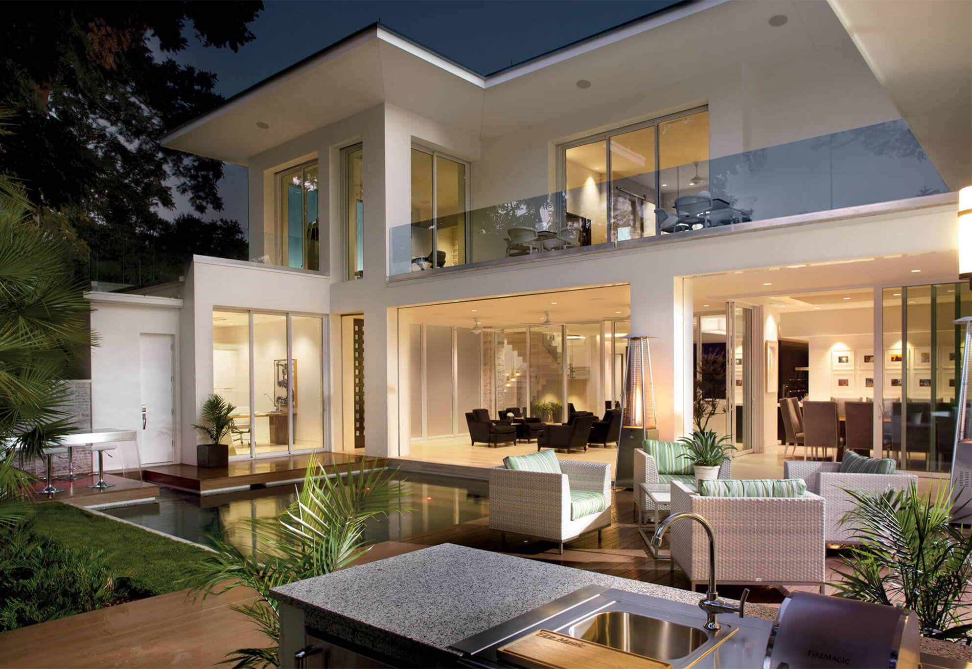
It’s a gorgeous place. And I think what really stands out to me is that the feel of the home really does bring that hallmark, that signature design that you have with that very open design with the flow of the floor plan. One of the images that catches my eye is where your pool is effectively inches away from your living area, your living room area, right? So you really have that indoor/outdoor connection.
Phil:
One of the design elements that we decided to utilize was you walked into the Lanai, so you didn’t walk into the front door, you walk into an open Lanai that could be screened in or not screened in. You had the motorized screens. So your outside space really sort of was part of the entry sequence, which was a nice detail. There weren’t any views to look out to, so the courtyard which was where the pool was became sort of the focal point of the garden. Most of the rooms either looked out onto the street or into the courtyard. I think it really allowed a lot of light. Also a lot of the windows all opened, they were sliders, so they all opened out to that outside space. So the house essentially could go from small-size entertaining area to the entire garden entertaining area, which it did, I mean on many occasions, there might have been a hundred or 200 people in that house at a time.
Jon:
Wow, and that does seem to be one of the things that I think more and more we are starting to see that people want. There’s that traditional sort of home that you’ve got your four walls and limited natural light, you know, limited air flow. It is seeming more and more that people are wanting that connection with nature. Especially now post pandemic, where we have a lot of us working remotely now, and it’s sort of that home office where we’re working from the home. It makes such a difference to have that connection to nature. And as you said, even if you’re in a city environment, so you’re in the Winter Park area, but you’re not boxed in by that city feel. Like you said, it’s a balancing act, you’ve got a five-story building here, how do we design this to where you still have that nature, that natural environment around to really create that holistic feel? That’s something I think you do very, very well across your entire portfolio is blending that. What is your process like in terms of that balance? I can imagine that there’s gonna be a lot of thought that goes into how open do we actually make this, making sure that we are balancing for weather, etc., and all the different variables that can play into that.
Phil:
So I sort of took dimensions and I sort of looked at where the building behind me was, you know, that shared the alley with this house. And I took a normal height that would be for eyesight and then I puffed up the actual house just tall enough that it would hide the five-story building from anywhere in the garden. And I did that in sort of 3d modeling and sketching. And with overhangs, that element, you never really see that five-story building while you’re outside in your own garden. So that was really sort of nice. You could be sitting in the pool and you wouldn’t have people looking at you or any of that stuff. I’m a little bit more modest in that it feels weird if someone’s watching you swim or something, I don’t know. But anyway, I intentionally used the architecture and the structure of the house to shield that view into the garden from the building next door.
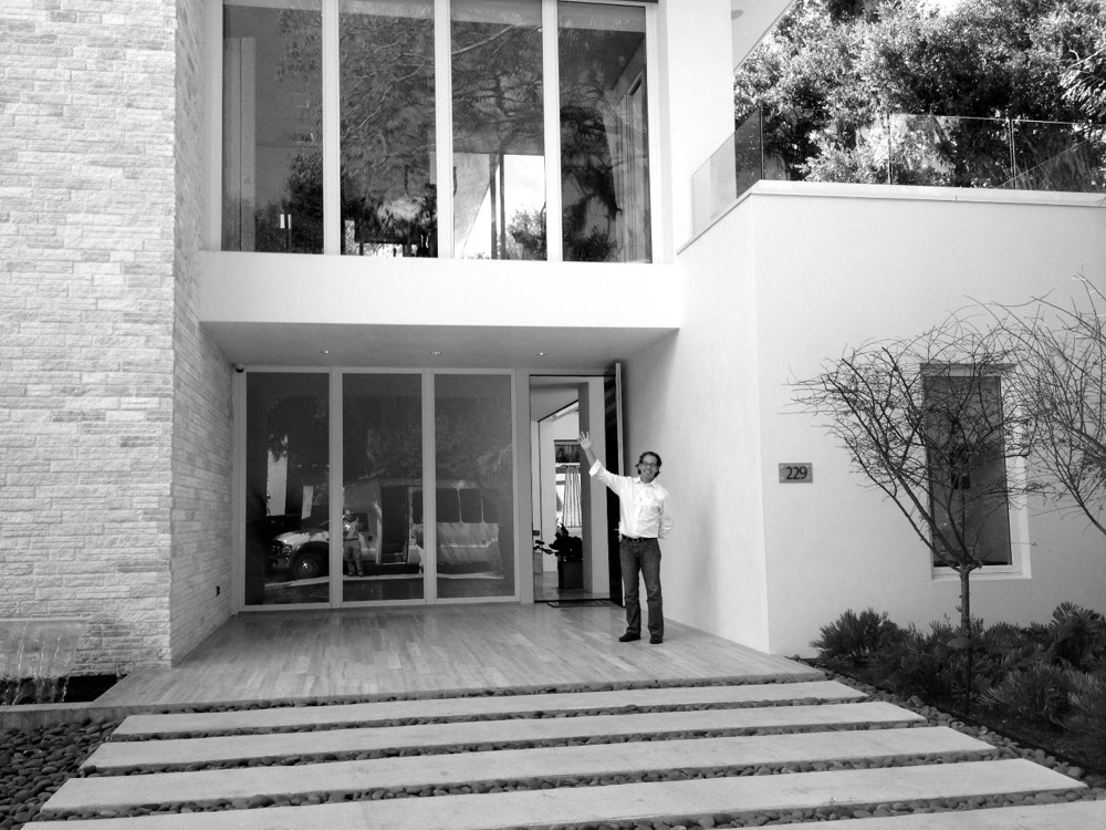 Phil Kean, Architect and Builder
Jon:
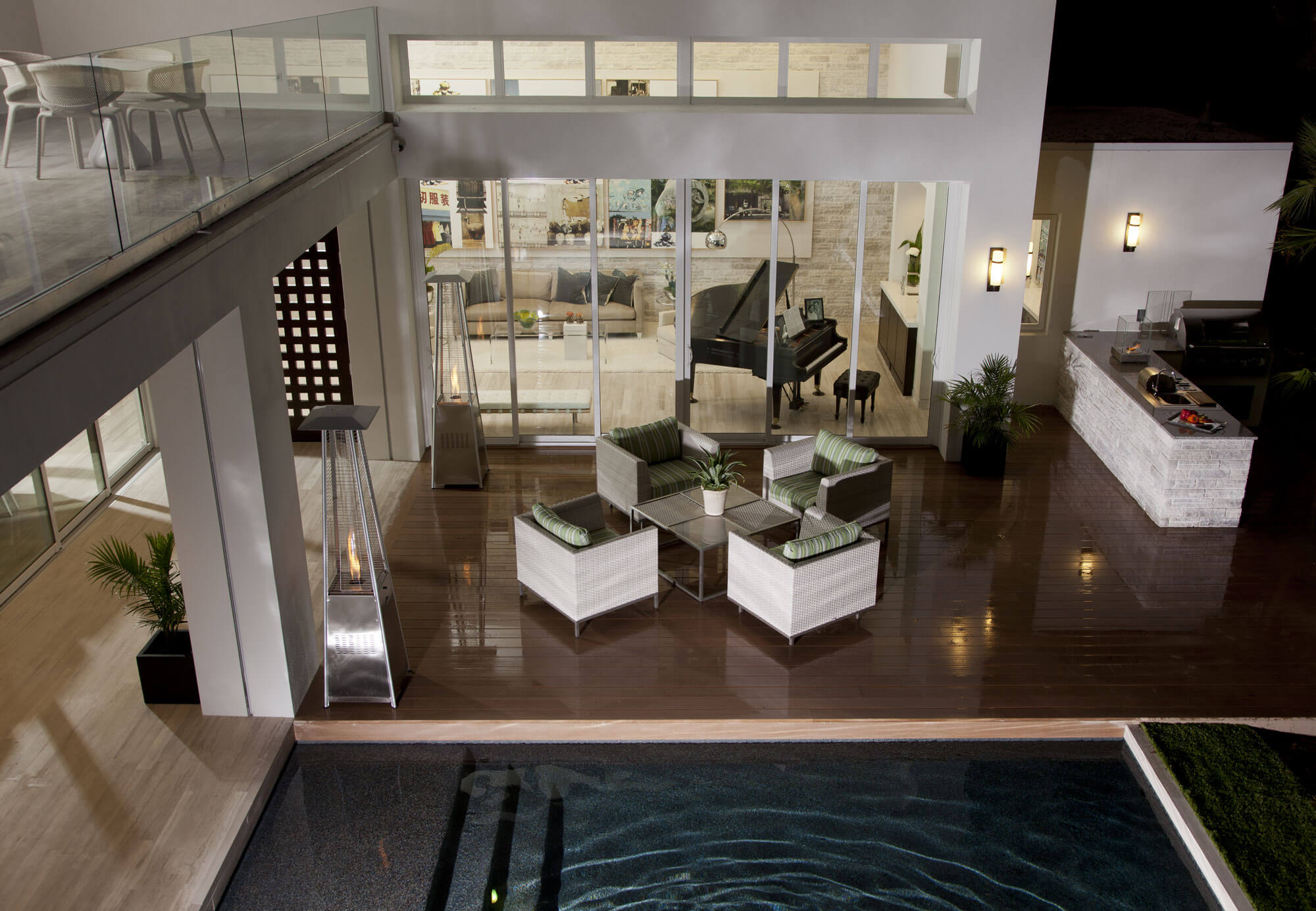
Yeah, that’s the challenge it seems, is that you’re really having to get the best of both worlds. You know, that’s something I’ve admired about your work that you’re so well at integrating that in. One of the details, while we’re talking about the outside space, that I really love is the deck and the cooking area… the outdoor kitchen that you have. It’s the placement of that, and the layout of that, I think again speaking to the balance from a visual perspective, where your outdoor kitchen is actually far enough back but still in close enough reach to help with entertainment, whether you’re firing up the barbecue or whatnot, you’ve got that proximity. From a visibility standpoint you’ve also been able to make that blend and almost camouflage it into the whole design.
Phil:
Yeah, it felt like you were entertaining while you were grilling or something the way it was positioned there. Many events that was used as a bar kind of, there was a bartender behind it and they were serving drinks or wine or whatever behind that. It was spacious enough so there could be several people and hidden way enough that they could have coolers and all kinds of things there. That was really versatile and served multiple purposes. If it was just me grilling or somebody just grilling, that was one thing, but if you were having a party you could use it for putting snacks, drinks, and things like that on it.
 Photo by James F. Wilson courtesy BUILDER magazine
Jon:
Exactly, and there’s that blending again, just as if it’s hand-in-glove, nothing feels out of place. I think that’s a huge point around your designs that I’ve always admired is that everything feels like it’s part of the larger whole, there’s that continuity across the design. I think there’s a lot of fragmentation that we see a lot of times, and I’m sure that you come across this a lot, when you’re looking at architecture where you see a sort of a fragmentation, either it’s between the indoor or outdoor or maybe some elements or accents that are in sort of a huge clash in terms of the look and feel and the fit.
Phil:
You have to think about how you’re gonna go for an indoor/outdoor feel or have it really feel like the outside is coming in or the inside coming out, I think it’s a combination of materials and scale. In this particular house we used the same material inside as we did on the covered lanai, and I think that was successful. We also finished and painted the inside ceiling tones the same colors and same finish. Another thing we did is we took our sliding glass windows and doors from the floor to the ceiling, so when they were open or slid away, that sort of blurred inside and outside. I think that by bringing the same materials out to the grill area, it all blended really well together. Almost like an extension, you know…an extension of the inside maybe out or the outside maybe coming in. It was one of my favorite details.
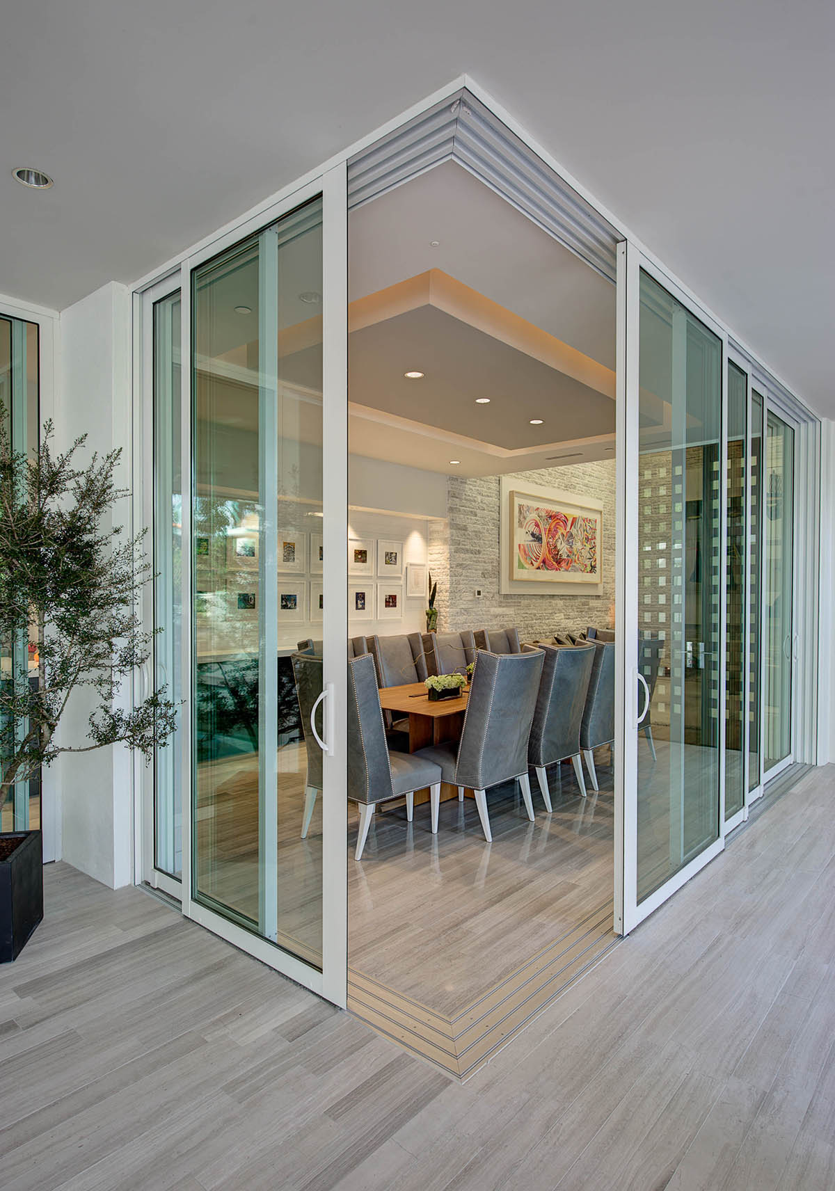 Photo by James F. Wilson courtesy BUILDER magazine
Jon:
Well, I can see why. As I’m looking at this right now, I can really imagine what it would be like to be in a large group there…you have the space. That’s another piece here, you have the space and the ability to be intimate and also have room to breathe. Just so many delicate balances…. As I was looking at this in preparation for today, it’s really just one of those points that over and over again you’re watching that line there being attended to very, very well.
Phil:
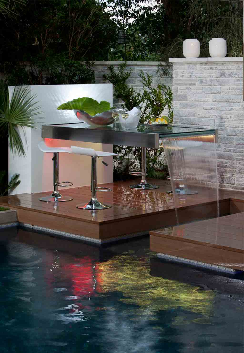
I was gonna say, also the water table off the pool was really sort of a nice detail. I would find that during parties, four people would be sitting at that table having a drink or having some wine. What it did is it also allowed a little bit of background noise, I always liked to use that as a buffer. I was one house in from the corner street, so it kind of muffled any kind of noises you might hear as well. So it served two purposes: it was sort of a cool aesthetic detail, a lot of people thought kind of a “Wow” factor, and it was entertaining at the same time, moving water is always something cool to look at.
Jon:
It’s such a great feature. I think because like you said, that white noise really makes people feel comfortable, especially if you’re someone who’s new to the environment or it’s your first time being there. It creates that freedom to sort of take a little bit of pressure off. But it’s also a beautiful thing even if you’re out there on an evening alone to just sit there, to relax, and to think, and to have that sort of meditative space as well. I think that that’s what is really exciting to me when looking at how this all came together. These are ideas that don’t populate without actually thinking through what the inhabitants are gonna be using the space for, and what could it actually do in its fullest potential?
Phil:
Yeah. It was interesting because it was a progression of how to use that space. It wasn’t like “Oh!” – the first thing I thought of. It was sort of something that as the pieces and elements came together, this morphed into this lovely little garden of tables, and water table, and the grilling area. The outside space was certainly really thought through, but still became almost like a little journey like, “Oh, well we have this space, what would be fun here”? And that’s sort of how that happened.
Jon:
Can I ask you about the balconies? Because I am fascinated with the balcony structure that you have because the views are impeccable. As you said, you’re balancing privacy, but also maximizing visibility from within the residence. What does the process look like when you sit down and really identify where and how to implement the balconies ?
Phil:
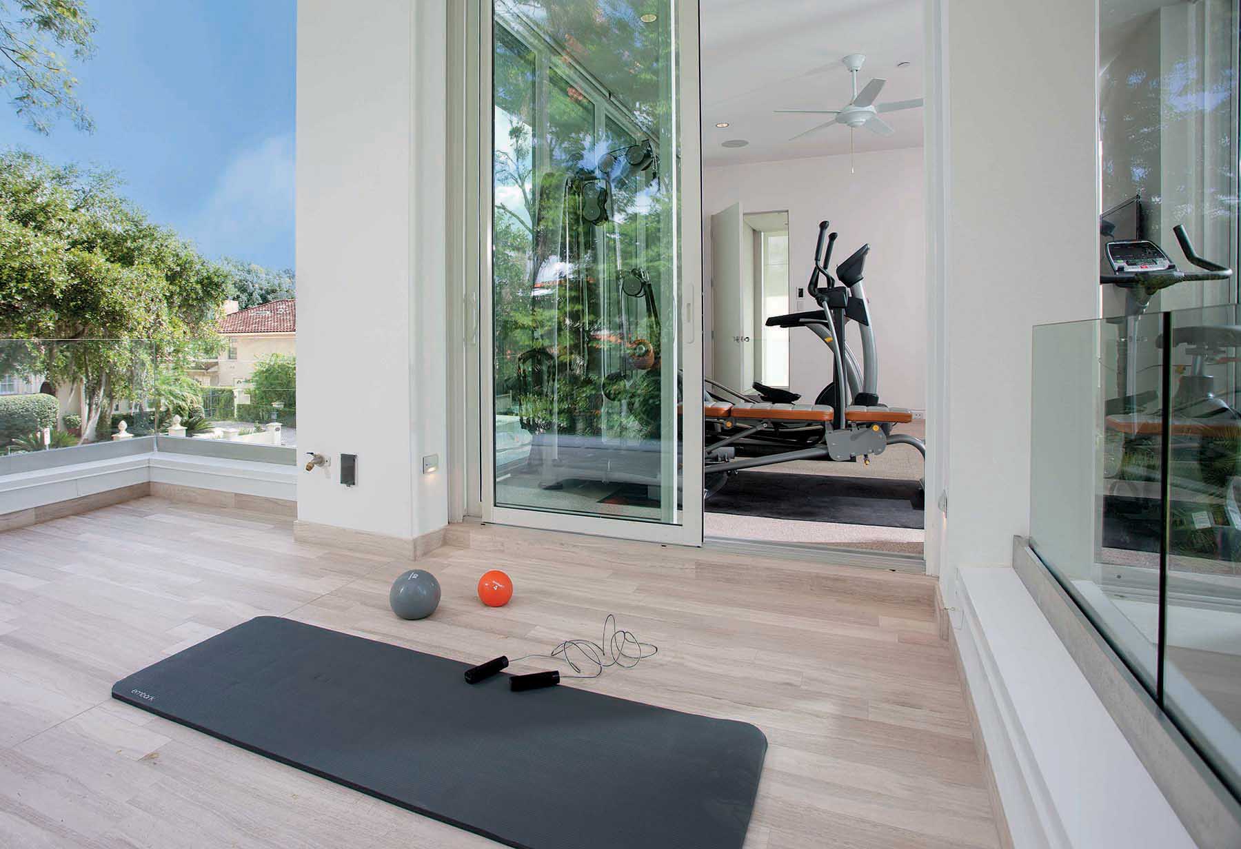
In this particular house, I had these geometries that came off: there were three rooms on the second floor – one was a bedroom, one was an exercise room, or could have been another bedroom, and another was a TV lounge kind of space up there. So I had the ability to have doors and balconies off those three rooms, and each of them had sort of a different feel. There was the one that faced essentially the street in the corner that felt like more of a social balcony. It was off the TV lounge. And then the other one was off the bedroom, which overlooked the pool, and it was much more protected and much more private. The views off of that and into that were much more protected. And then the other balcony faced toward the lake, and it was off the gym, and we called it the yoga balcony. So you could go out there and take in fresh air and maybe stretch or whatever. It was a little more protected from the major road. It was certainly more visible than the bedroom balcony. They had sort of a sense of order and priority.
Jon:
And I think it also maximizes your experience in the home because you have the variety. Like you said, you’ve got an exercise room, and you’ve got your place to go outside to stretch, and yoga, and have some alone time if needed. So you’ve got that spectrum of opportunity to go where you want to go to do what you want to do. While we’re talking about the navigation within the home, it strikes me how open the home is while also having such a clean, beautiful structure as well. What is the inspiration for you when you look at flow within a home?
Phil:
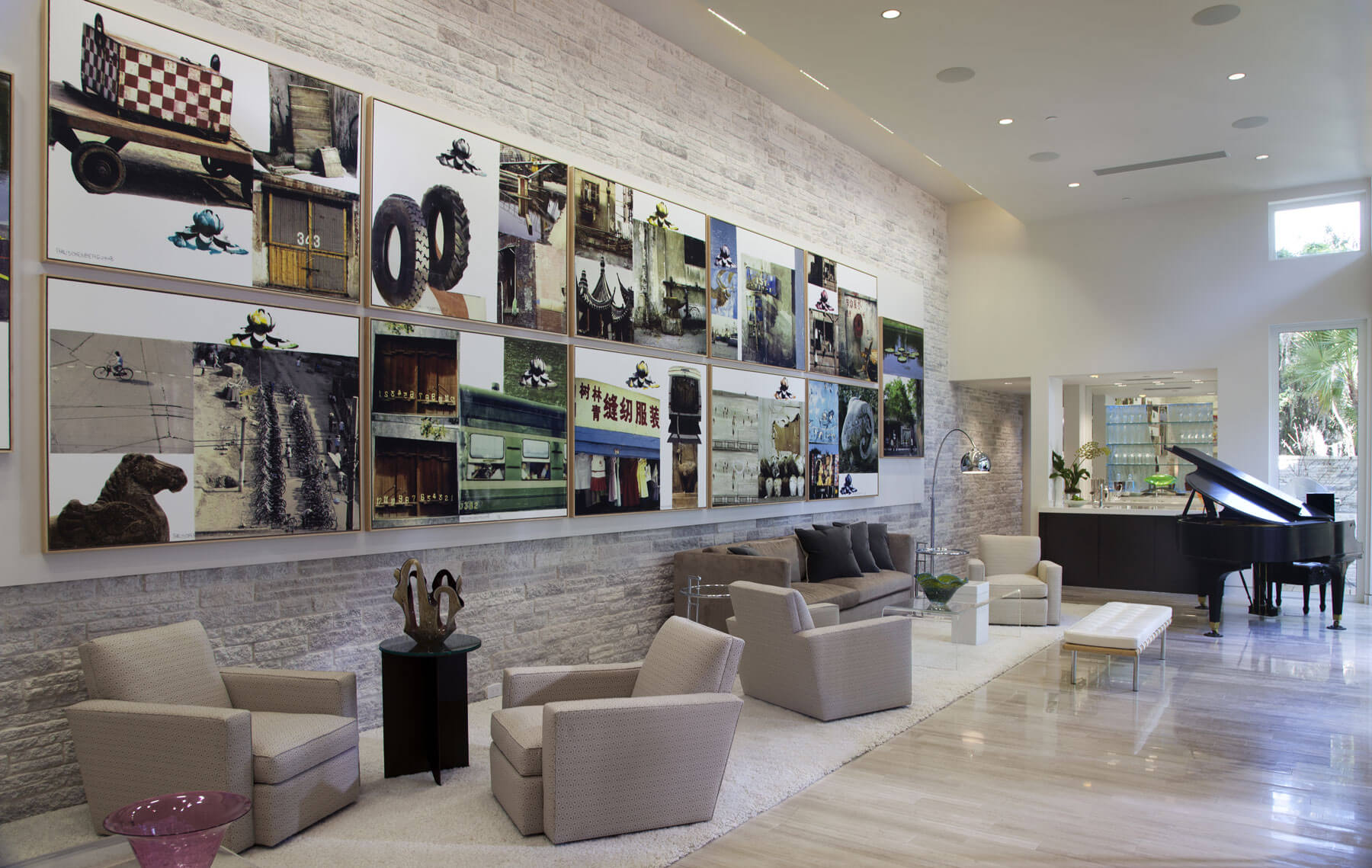
Well, I usually start with a floor plan and then I go to the elevations. The idea with this flow was that first room you would go into would be your most formal room, but you would pass and look into some private rooms as you’re passing through the lanai. So the first room you came to was the gallery, and there were no windows on the one side because it faced the alley and the other side faced the courtyard. So that was the first one. In that room there was a bar, so it was really set up for entertaining. There was a powder room there, and the bar, and a very minimal hallway to take you to the powder room.
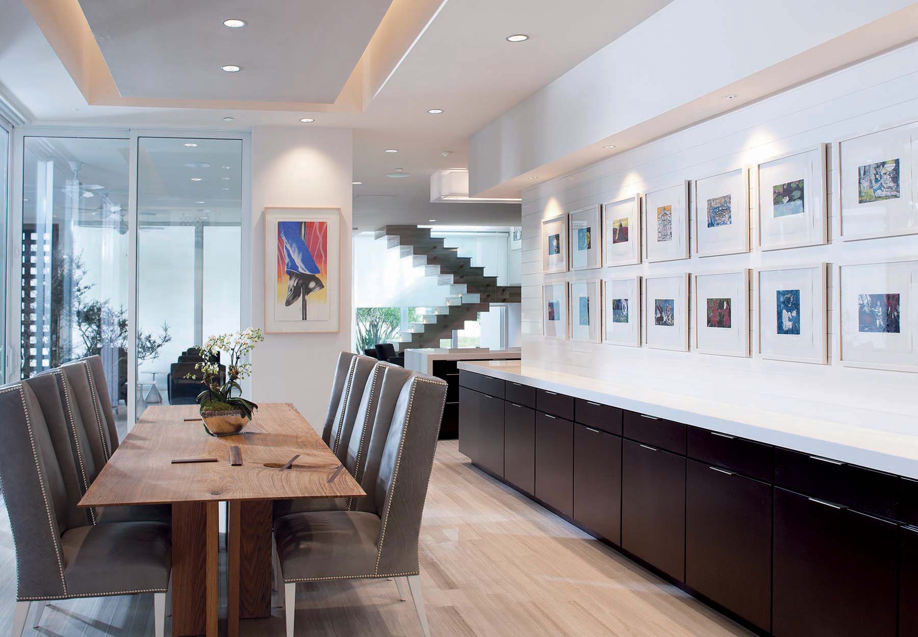
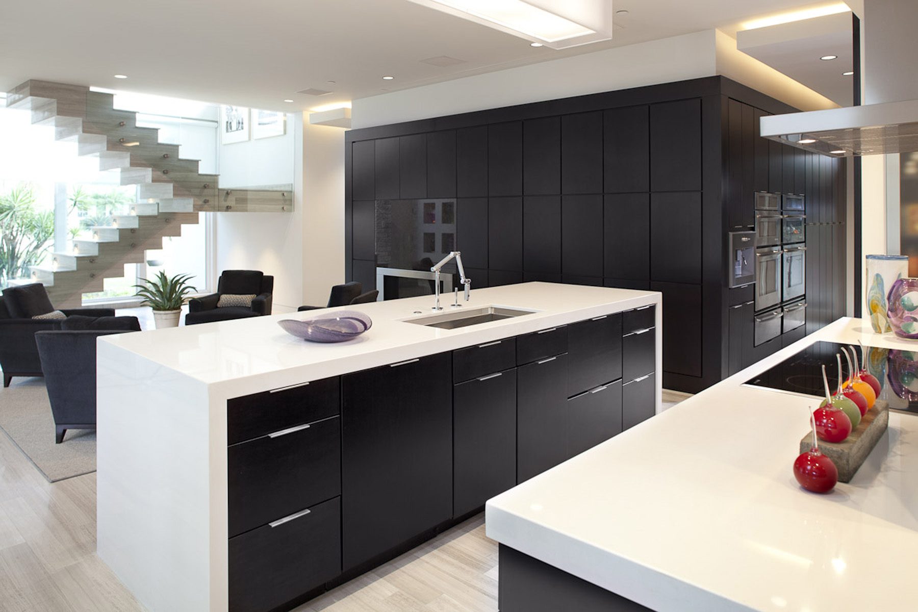
Then as you go the other direction, the lower ceiling height is what created the dining room. The dining room was kind of an L-shape flow, so you went from the gallery and in this particular case you took a left into the dining space. And the dining space, by use of cabinetry and countertops, then took another L-shape off the dining room into the kitchen. The cabinetry became the buffet in the dining room, and then as it turned the corner it became the counter of the kitchen.
It was really tailored so that cabinetry went down a hallway where it was paneled on both sides of the hallway. I called it the appliance corridor, so I put all of the big appliances, the ovens, the microwave, the coffee maker, things like that down one side of the corridor. The other side of the corridor had the refrigerator, pantry, and access to the garage and a small laundry room. And then I used that cabinetry again to wrap around and it brought you into sort of a, I call it the “coffee lounge”. You could watch TV there, it had four chairs and opened up to the garden. Off that room there were stairs to the second floor, and there was an office and a bedroom off a small hallway, and a powder room on that side as well.
You’re sort of going from more formal to less formal, and then you’re going up to the second floor which has the three rooms. So it was really layered for “how exposed are you gonna be during a party?”. So the master in this particular case, or the primary as the more politically correct term, the primary bedroom was on the second floor away from entertaining and noise, but the house had an elevator so that if somebody were, if it were necessary, they could use the elevator to access the primary bedroom and bath. So it had a layer, and it was ordered as formal to less formal.
Jon:
Yeah, and the thing that strikes me about that is there IS a seamless flow. When I take a look at every different angle, you never feel like “it fits”; even though, as you said, you’ve got formal and informal, and sort of private and public sort of facing rooms…you’re still feeling that integration.
Phil:
Yeah. The spaces visually blend into the next room, but by using compression and materials and things, it created a sense of place. It wasn’t like one big room, but it flowed like one big room, if you understand that concept. There was definitely a gallery that had taller ceilings, I had designed that gallery to be the room that blocked the view from the five story apartment building. During the process of building it, I felt like the scale was a little tall so I brought the ceiling down. It was a great space, one of my favorite spaces. I actually designed a space recently using that same proportion of that room. It was such a great room.
Jon:
I can see why.
The point that I want to move into next is something that I have a personal passion for and a lot of interest in which is the materials that are used across the residence in the flooring. It is so different in many ways in different parts of the house. I think it really draws in the depth of the room in some areas, and in some areas it really creates that clean, crisp feel, for example in the bathrooms where you have that beautiful marble. Can you tell me a little bit about the process that you went through in terms of materials and maybe even in terms of sourcing if that’s relevant as well.
Phil:
That house was a show house for the National Association of Home Builders. So it was sponsors, you know, there were people that wanted to showcase their product. I had the final say over all of that, but some I had to use was Daltile as Daltile was one of the material suppliers. It was a combination of “what can I get in time”. I built this house in eight months, that was a real tight timeframe, so my first choice oftentimes was not available. Actually the flooring that I put on there was a second choice, but it was pretty awesome that I laid that flooring. It was a linear cut limestone. I laid it in a way like you would lay a random pattern for wood flooring, so a lot of people think it’s wood because it kind of looks a little like wood, but it was warm. It had a real warm tone to it. Because it was limestone, I could take it outside. So I used it both inside and outside on the first floor. That was really important for me to have that connection to the two. Then on the second floor, we used product from another vendor, so we did a Walnut on that level. In selecting products, because of the not knowing, I went with a light and dark. So I would pick either one of the lightest products available or one of the darkest products available from the vendors that I needed to work with. I could always say “no”, but part of that was to showcase the best of some of the best vendors in the country. So that was kind of exciting, because like the stone on the walls, they didn’t have the product I wanted, so this manufacturer…I designed it and they developed a new product that they are still selling today out of that house. So that was a cool experience in that regard to have a vendor, and you get to design it. I got to design light fixtures and I got to design…, so all of that was really a one of a kind type of experience, but it was really very fun. Very, very fun.
Jon:
Well, now that you mentioned lighting, I have to ask about that because the lighting is remarkable… the fixtures and the different elements that you’ve brought in. I think you were able to highlight, in some cases, the height of the ceilings and other cases it really brings in the warmth of the room. So with the lighting, is that something that you took inspiration from maybe a different project or from maybe something that you wanted to try or experiment with on this? What was there a backstory on the lighting? Because it is fascinatingly beautiful.
Phil:
When I was in college I took some courses in lighting and lighting design. I knew that lighting was going to be really important, so we used lighting both as a direct light source and as a sort of a design ambience type light source. That was really fun. This was designed over 10 years ago and LEDs were not quite as accessible, so a lot of the products just weren’t available in LED. So the manufacturers and we worked together to create products that used a more energy efficient light source. That was really fun. We did some modifications in the field to get the right values. Part of the design process was “how does the light work in this house?”. I think it’s successful.
Jon:
Absolutely. I would say one of the areas that I love the most is in the kitchen area… it’s beautiful the way the light creates that warmth, it’s very inviting. When I look at these shots of these images, the thing that pulls me in is how easy this would be to just see yourself there. It’s one of those things where you see it, and it looks inviting, it pulls you in, it really does pull you in. And I believe that your choice of lighting and how you did that, especially ahead of the curve, in that sense, sort of ahead of the time so to speak in terms of LED usage, on that I take my hat off to you. I want to ask you as well about the sustainability on this. I think that sustainable design is something that you’ve been able to not only become proficient at, but there’s a degree of industry level respect that you have in this space when it comes to understanding and implementing sustainable design in these types of homes. Could you share a bit of maybe either the macro or maybe even down to the micro in terms of how your sustainable design impacted the end product on this residence?
Phil:
One of the cool things about this house in particular is that it was the greenest house built in 2012 in the country. It had the highest energy-efficiency and was recognized for its green factor. Some of the things that we put into the house that made it green was that we used all low-flow fixtures, toilet and showers, all low-flow. So water usage was really carefully managed in this house. We used LED on all of our lighting. We used all Energy Star appliances. We had solar on our roof. We also did insulated concrete forms. They’re called ICF and they are forms that are like an insulated block and it’s almost like a Lego kind of assembly. They are filled with steel and concrete and then you put your material on top of that to finish it off. So on the inside you would have your drywall and on the outside, in this particular case, we had stone and stucco. Those were some of the green elements. In addition to that, we did a Florida-friendly lawn design where all the plants in the entire yard are all Florida native. So the advantage to that was that it helps to feed the animals native to Florida and uses much less water because they don’t get sprinkled in nature, so they get just enough water. We used some artificial turf to get that sort of lawn look, but overall it was a very cool project. We used a product for the deck around the pool that was made from recycled salt and rice husk, you know, like the residue of when they make rice. That was kind of cool. So that was some of the things that made it energy-efficient and the greenest house in the state of Florida and the country in that year, which is an honor.
Jon:
That’s a very remarkable honor. I’ll tell you that is! If you think about the amount of homes and residences that are built, especially in the last 10 years, I mean, this is something that is actively being pursued by architects. And to be able to reach that, you know, that’s…
Phil:
Well what was interesting is the following year I went out to the west coast which has been known to be so much more green-forward. And I went out just to look at homes on the west coast during almost like a green build blitz, kind of, it was sort interesting because there were things I thought they could have done so much better. And, I was just a novice at it at the time. So I was really fortunate to have an amazing green certifier and consultant help me on this project. In the process I learned a lot too on the things that really work well and things that don’t work well. Another thing I did on this house was I put screens on the outside of all my windows so that the sun never hit the glass, so it kept the house much cooler. Then my roof was white, so in Florida that’s pretty cool because that’s what you need here is to reflect that light. As we’re talking more and more things come back, how it just ended up being this amazingly green house, <laugh> or energy-efficient house.
Jon:
Very much so. Thank you for going into that detail because I think one of the parts that I enjoy the most out of these conversations is the new lens with which we can see this project. I also believe if someone’s listening to this and they say, you know, I have this as a goal, I want a sustainable residence and I want the design to be beautiful. And to achieve all these goals as well, you know, to tick off all the right boxes. I think it’s exciting for them as well, to be able to listen in on this and say, look, it is possible to have your cake and eat it too. I think that’s where this type of conversation is very, very intriguing. I think both you and I, but also for the person listening in on this, who has the interest to move forward and spark a conversation with the firm. Just one last question for you, Phil, unless you had anything else to add onto that?
Phil:
No, I could talk about green all day long. Maybe that’s another topic. <laugh>
Jon:
Definitely, I would love to cover that on a subsequent conversation for sure. I’ve got a load of questions around that I think would be worth diving into an understanding. I think I’ll just touch on one quick point before I move onto the last question: you would expect with a home that is the greenest home to not have as much technology built into it as what you have here. It’s extraordinarily well lit, the amount of appliances, and screens that are visible everywhere. And I can see sound, audio, you know, installed as well. I mean, there’s so many pieces to this puzzle that it is a bit of a shocker to a lay person like myself to imagine this as the number one green home, because of the fact that I think as lay people, when we see, or when we think of green, we think, okay, great, but that comes at a cost. And I think what you’ve demonstrated so well here is that you’re able to achieve that without the sacrifice.
Phil:
Right, there’s no sacrifice to be sustainable. Today there’s virtually no cost difference. You don’t have to think twice about having low VOC or no VOC products in your home. I mean, 10 years ago, you had to sort of carefully look for everything, but today you don’t, it’s the standard. That’s really important for people to know that being green does not mean just energy-efficient. It means being healthy. The things you put in your house is also part of what makes a house really green. In this house I collected rainwater to use in the garden and for extra watering I would need. So all of those little things, you don’t really think about that, and those don’t really cost anything. Here in Florida, every once in a while, we’ll have a drought where we can’t water our lawns. So that made it really great to be thoughtful about water usage and collecting water and people do it. But it’s really easy. People can have bladders and collect as much water as they want, especially for secondary uses. It’s really great.
Jon:
I think that’s the point, right? It is. Not only is it an advantage to the ecology and to the environment, as you said very well. I think this is something that as we become more and more health conscious as a nation, I think that is one of the pieces of the puzzle that we begin to sort of understand. I think one of the obvious major issues obviously was the whole asbestos, you know, back then wasn’t being implemented in construction wasn’t really ever addressed until it was too late. And I think that is where we’re understanding our world today is that the sustainability and greenness, so to speak of your residence, we may not even know the full scope of benefits until 20 years, 30, more years down the line.
Phil:
Yeah. I do think it very easy today to thoughtfully place things in your home and use materials that are better for the environment and better for you in the long run. I think that’s what this house in 2012 really explored. And I think it was one of my favorite homes I’ve ever worked on.
Jon:
Phil, as always thank you so much for the time today, what an amazing conversation. I want to thank you for giving us this sort of a virtual behind the scenes on the process and the beauty that we have here. I mean, this is great, great, conversation. So thank you very much.
Phil:
Well, thank you. I hope it inspired somebody to do something a little different, <laugh>.
Jon:
Absolutely. Thank you, Phil.
We hope you’ve enjoyed this interview. To learn more about how you can work with Phil Kean Design Group, visit PhilKeanDesigns.com.
