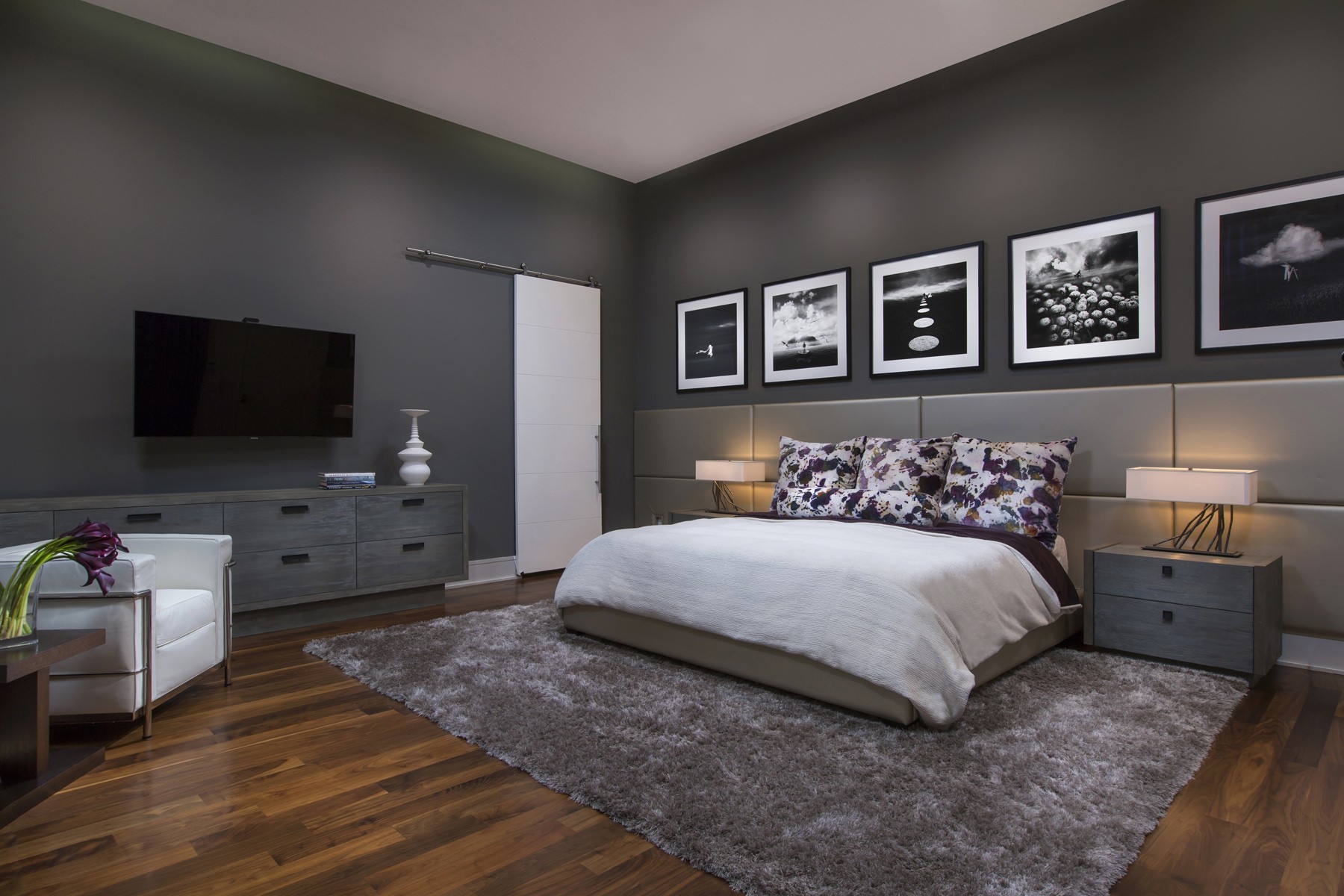
Pleasing colors and visual cues support the idea of comfort and serenity (Behr, 2017a). Therefore, interior decors decorate modern, high-end architecture sites with intention by using colors that have personal meaning and give the greatest sense of satisfaction.
We are officially halfway through 2017 and people are already pretty eager to see what 2018 has in store. Of all the design trends we look forward to most in the coming year, color holds a steady spot at the top of our list. After all, it sets the tone for what furniture we buy, what decor we invest in, and the overall mood for that design year.
According to Pantone, the trendy 2018 colors will be brighter and more contrasting. It will be in vogue to match so-called vegetable colors (especially the foliage) with purple hues for example, colors approaching that of the berries! On the other hand, the complementary colors will also be present. The tones of oranges and blues for example will compose interesting decors (Kelsey Kloss, 2017). Behr Process Corporation, which is a provider of architectural paint and exterior wood care products to the US markets, recently released a palette of 20 trend colors for 2018.
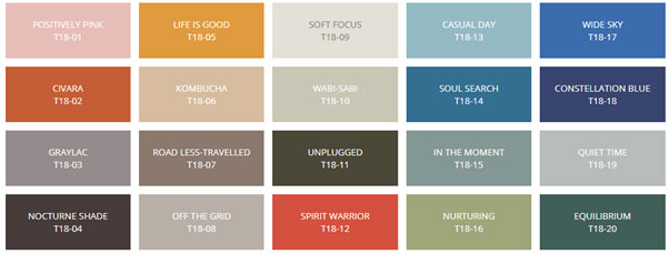
Source: (Behr, 2017a)
Sherwin-Williams-2018 Trend palettes
Sherwin-Williams is a US based Paint and coating manufacturing company. Sherwin-Williams predicts that 2018 will represent the spirit of modern life with their three color palettes: “Affinity, Connectivity, and Sincerity.” (Sherwin-Williams, 2017). Each one is inspired by the collective culture of the moment — from fashion to technology — and captures the aura of a year that is bound to be full of progress.
Affinity
This color story of striking blue, animated fuchsia, and stabilizing brown, the Affinity palette is set to celebrate the connection of people and places (Sherwin-Williams, 2017). “We’re remapping our sense of community, landlocked cities are becoming global hubs of crafts and gastronomy,” says Wadden, Sherwin-Williams’ Director of Marketing. “Home and car sharing, as well as e-learning, have created a culture of everyday nomadism and the wanderlust-obsessed.” (Tardiff, 2017)
Affinity is just like any good getaway: relaxed but full of unexpected fun (Sherwin-Williams, 2017). When it comes to modern, high-end architecture sites, American interior decors can decorate accordingly with a base of neutral browns and vibrant accent colors in an array of pinks and blues.
Source: (Sherwin-Williams, 2017)
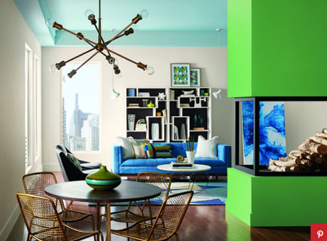
Connectivity
The Connectivity palette draws from innovations in tech, including pixelated oranges, digital blues and greens, and high-def yellow. “In Silicon Valley, Austin, Berlin and Beijing, techies are the new hippies, full of breakthrough ideas and utopian ideals,” Wadden says. “Connectivity is modern and playful, bringing in dark watery tones of blue that are balanced with neutrals, warm yellow and energetic purples.” (Tardiff, 2017)
When it comes to modern, high-end architecture sites, in 2018, American interior decors can punctuate any room with some tech-inspired hues (like this bright green fireplace), while working in some much-needed warmth with understated grays and creams.
Source: (Sherwin-Williams, 2017)
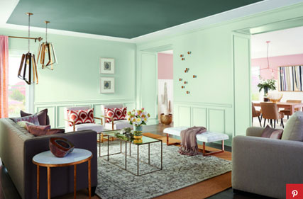
Sincerity
Minimalism isn’t going anywhere in 2018. However, it is taking on a less structured look. “With the Sincerity palette, silence is no longer empty, but instead is rare and rich with possibility,” says Wadden. “Sincerity is about mindful living and environment to disconnect and recharge. Soft, washed neutrals, greens and sanctuary pinks work together to create harmony.” (Tardiff, 2017)
American interior decorators can step away from the stark light and dark contrasts and embrace color fluidity. This palette is all about ditching harsh lines for sandy browns, muted grays, and hazy greens that harmonize perfectly. They should not stress too much about sticking to a strict color scheme, but instead let one organic shade blend into the next.
Behr-2018 pallet
Behr 2018 pallet is a collection of carefully selected with avant-garde shades and accessible, segmented into 3 color themes: comfortable, posed and confident. Each theme is inspired and personal, designed to help high-end interior decorators to create a home that corresponds to modern style and personality.
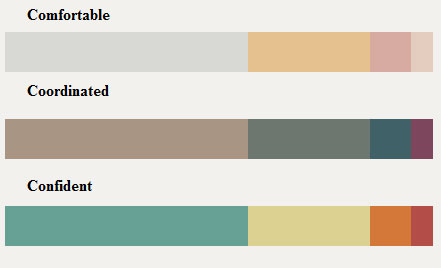
Source: (Behr, 2017)
Comfortable
The comfortable colors are soft pastels that move away sweet and bright colors. They give off femininity and refinement especially when matched with natural and light tones.
Coordinated
The coordinated colors are ideal for overlaying and other colors furniture and decoration. This pallet comprises a mixture of colors earth and precious stones.
Confident
Interior decorators can create drama in the modern kitchen by combining black and white cabinets with bright blue-green walls. Navy blue and yellow make a perfect fit pair in a child’s room. A burst of orange adds an element of pleasure and adventure.
In 2018, some colors will give a smile to anyone who dares to integrate them in its decor. In its palette, Behr included bright yellow, lime but also flash colors such as blue and green. For more subtle decorations, the colors such as Elder, Hawthorne Rose and Lilac Brown will be present and can be combined for more tranquility and softness.
Source: (Behr, 2017)
Other Palette Trends in 2018
Shades of pink and metallic shades
According to Eco Painting webpage, a 2018 trend palette will feature three tones of roses with which high-end interior decorators can combine more earthy tones reminiscent of coffee or corn kernels. On the other side, the metallic colors are the new neutral colors. They can combine with deeper colors such as red cabbage and yellow sulfur for the interior of modern architectural sites (Eco Painting, 2017).
Intense colors
“Intense colors seem to be a natural application of our intense lifestyles and thought processes these days,” says Eiseman. She divided the color trends into eight groups, one of which is named “TECH-nique”, a palette that apparently pays respect to technology. Colors comprise fuchsia, green, bright blue and purple, which are supplemented by lustrous tones of hot pink and turquoise, white and frosted almond (Way, 2016).
As per Pantone, in 2018, it will be the shades of plums as well as certain shades of blue or flamboyant colors or even black, to make up this rather sophisticated palette characterized by power (Way, 2016).
Color is both a journey and a celebration. For high-end interior decorators in the US, exploring options is part of the design process. In 2018, for the interior of modern architectural sites, dark colors will convey an air of mystery and drama, while light colors will create a feeling of spaciousness. Now it’s up to the high-end interior decorators in the US that how to select colors and impart unique mood to create the perfect ambiance for the modern architectural sites and homes.
References
Behr, 2017. [Online] Available at: https://fr.behr.com/consumer_ca/inspiration/2018-colour-trends [Accessed 2017].
Behr, 2017a. [Online] Available at: https://www.behr.com/consumer/inspiration/2018-color-trends [Accessed 2017].
Eco Painting, 2017. Painting: Color Trends 2018. [Online] Available at: https://www.realtor.com/news/trends/pantone-2018-trends/ [Accessed 2017].
Kelsey Kloss, 2017. THE PANTONE COLORS THAT WILL BE TRENDING IN 2018. [Online] Available at: https://www.elledecor.com/design-decorate/color/a9178549/pantone-colors-2018/ [Accessed 2017].
Sherwin-Williams, 2017. [Online] Available at: https://www.sherwin-williams.com/architects-specifiers-designers/color/color-forecast/2018-color-forecast/unity [Accessed 2017].
Tardiff, S., 2017. THESE ARE THE 2018 COLOR TRENDS THAT SHOULD BE ON YOUR RADAR. [Online] Available at: https://www.elledecor.com/design-decorate/color/a10011137/color-trends-2018/ [Accessed 2017].
Way, N., 2016. Pantone Predicts 2018’s Hottest Home Trends. [Online] Available at: https://www.realtor.com/news/trends/pantone-2018-trends/ [Accessed 2017].